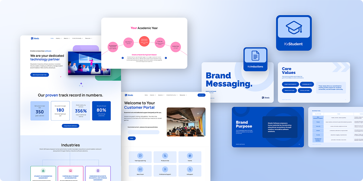
Kinetic Software approached us with the mission of revamping their website and brand presence. Their existing site failed to accurately reflect their forward-thinking identity. The site’s shortcomings included poor navigation, slow load times, content overload, overlooked key information, outdated design, a high 54.3% bounce rate, and ineffective communication of their value proposition.
To address these issues, our services included copywriting, brand messaging, SEO, video editing, and website design and development. This resulted in a user-friendly site that resonates with Kinetic’s audience and drives measurable results.
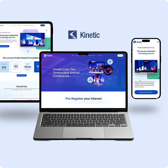
Kinetic’s brand messaging lacked the clarity and cohesiveness equal to their service quality on the ground. Our discovery phase ironed out the disconnect. We teased out every gem of truth and kernel of wisdom from detailed competitor research and an exacting brand audit. The result was carefully crafted brand messaging that acknowledged industry-specific challenges, the value of Kinetic’s product offering, and positioned the company as the undisputed solution. With a brand messaging framework containing such nuggets as The Kinetic Way – a tagline that powerfully encompasses their customer-centric approach – we presented their expertise and innovative software solutions as the key to streamlining operations for higher education, event management, and catering industries.
By highlighting Kinetic’s strengths in usability, security, and user experience, we gave stakeholders tangible reasons for perceiving Kinetic’s trustworthiness, leadership, and the company’s unique ability to address clients’ needs with precision and clarity.
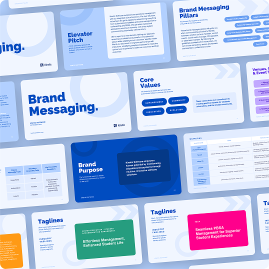
Our web content writing clarified and structured Kinetic’s market positioning. We zeroed in on key messages, removing redundant or overly technical jargon to make the site more accessible and digestible for their audience. We optimized the copy and ensured all relevant keywords were naturally incorporated to maintain organic rankings. The refined copy helps users understand Kinetic’s offerings and the tangible benefits their software solutions deliver, encouraging conversions and boosting engagement. This included replacing ineffective CTAs with more persuasive and impactful alternatives. The feather in our cap for this project had to be condensing 200 pages of content into a site of fewer than 20 pages without sacrificing an ounce of their product offering’s value.
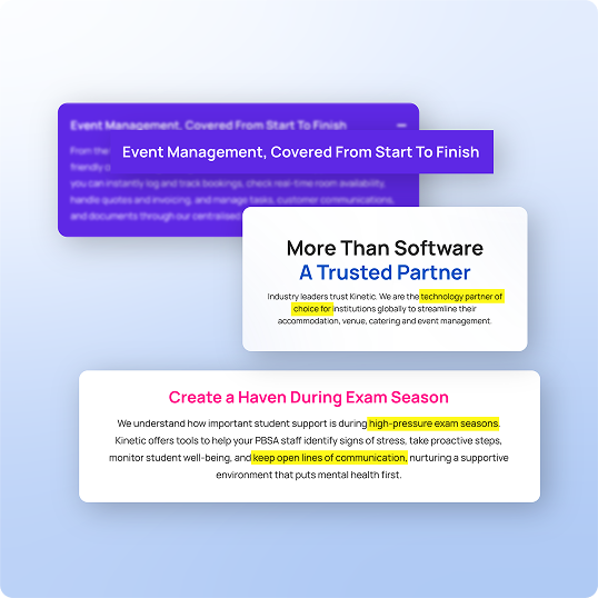
The redesigned website was built to be sleek, modern, and functional. We distilled the original 200+ pages down to a focused 20-page structure, prioritizing user navigation, speed, conversion optimization, and branding and messaging alignment. Kinetic’s new online presence showcases its innovative spirit with a clean, engaging, and intuitive website. Custom icons, vibrant visuals, and dynamic animations were incorporated to energize the user experience.
In the backend, we resolved over 800 SEO errors, optimized the site for better performance, and ensured it was structured for future growth. The result was a visually appealing website that delivered tangible results, including substantial increases in form submissions and user engagement.
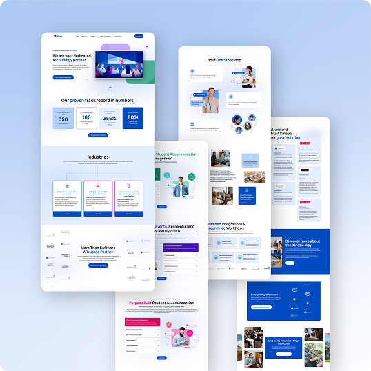
We overhauled all graphic design elements to align with Kinetic’s modern, tech-forward brand. The overhaul included a new suite of custom icons and graphics that highlighted their key services, target industries, and unique selling points. We strategically placed the design elements throughout the website to facilitate a clean layout, break up dense text areas, improve readability, and inject visual interest.
We also reinforced the brand’s identity with industry-specific color accents and an overall look and feel that reflects their vibrant, dynamic ethos. The result was a more visually engaging, user-friendly site that more accurately captured the essence of the brand.

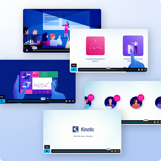
We created a dynamic, animated homepage video for Kinetic Software that brought their brand to life through motion, storytelling, and clarity. This project was a true cross-disciplinary effort – our team collaborated on everything from scriptwriting and storyboarding to animation, motion design, sound design, and editing.
Rooted in the brand messaging developed earlier in the project, The Kinetic Way served as the narrative thread, positioning Kinetic as a reliable, forward-thinking partner. The video not only reinforced their refreshed brand messaging but also played a critical role in:
The result: A high-impact asset that helps users immediately grasp the value and power of Kinetic Software from the moment they land on the homepage.
Before the redesign, Kinetic’s 200-page website was cluttered, outdated, and lacking cohesion. The absence of proper SEO optimization further hindered its visibility and effectiveness as a touchpoint.
Our involvement paved the way for a streamlined, visually dynamic, user-friendly, and more cohesive brand experience. With significant increases in form submissions, user engagement, and SEO performance, the new 20-page website is easily our magnum opus, attracting and converting visitors to drive concrete business outcomes.
